

Associate
some really nice entries wouldnt like to have to pick one lol
First idea that sprang to mind...
Not as good as Raikiri's though

Above is 1st one I came up with but wasn't sure about the stripy arrow so did this one as an alternative:

Might do some better ones if I get time
My attempts

I like these they even look great on my crappy laptop...
are we allowed to say crappy? if not see ya in 2 days
You're a sharp one aren't you.Looks too much like;

")
By far the best. This is one of the only ones that actually looks like a logo for a national business rather than some local job!
Not sure on the position and wording of the strapline though. Would prefer it either directly underneath or not at all.
Great work though!
ps. Only read pages 1-4 and 7-8 though


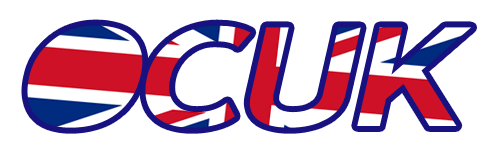
I wasn't happy with the arrowy bit [corner of the GB flag] from before and I notice some of you picked up on that. I realised it was loosing the 'O' shape a bit so this is a revision reflecting that.
Thanks for the comments guys, tagline dispensed and shoved in the one off the main shop page.
I wasn't happy with the arrowy bit [corner of the GB flag] from before and I notice some of you picked up on that. I realised it was loosing the 'O' shape a bit so this is a revision reflecting that.

like this?


