Georgia vs..

Soldato
Joined
18 Oct 2003
Posts
19,413
Location
Midlands
Hey all,

I've recently redesigned our corporate site at work. It's a departure from our normal style and as such I'm getting quite a bit of resistance to the changes.

Primarily, I think it's the font, so below I've included a few different font examples and I'd appreciate your comments, i.e. which you prefer the look of. A bit of lenience for the sans-serifs might be needed as the site was designed with Georgia in mind. Also bear in mind our industry and the other typical sites you would associate. Comments over the old site would also be welcome, amttraining.com.
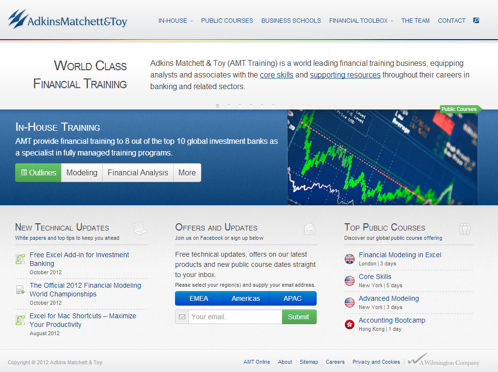
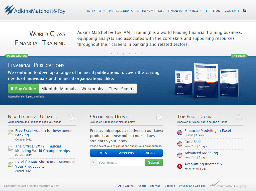
arial.jpg
lucida.jpg
verdana.jpg
georgia.jpg
 
Associate
Joined
25 Jun 2006
Posts
252
It's funny you have posted this thread, this **** had done my head in all afternoon, trawling google fonts and websites in general for guidance on font usage, I'm trying to narrow down fonts for a project I am working on, lost my rag in the end and set it to Arial, Helvetica, Sans-Serif, and dropped the font size to 0.9em.

Anyway enough of my problems, I personally prefer no. 3 although I do also like no. 1, couldn't make my mind up, although they all vary slightly, particularly the last one, I think they all look well balanced! A pleasant, balanced design in general :)

My tuppence worth anyway...

J.
 
Soldato
Joined
6 Mar 2008
Posts
10,078
Location
Stoke area
I couldn't tell the difference between the first 3, but the first did appear better to me overall.

Last one also works, but it reminds me of something else that I can't place my finger on. Thinking something American and financial but not sure what.
 
Associate
Joined
24 Jun 2007
Posts
1,869
Location
Landan.
Have you tried Georgia for the headings and sans-serif for the body? Also what sans-serif font is that - Arial? There's much nicer available that I'd use before that - Calibri, Segoe UI etc. Also worth looking at http://www.google.com/webfonts. Oh and for me personally, the use of bold first letters on the title is really jarring/annoying so I'd drop that.

I always find that a combination of serif and sans-serif works best, and it takes some playing around to get the right mix. For example on your fourth example, I like the use of serif on the "Adkins.. is a world leading financial..." paragraph towards the top. Whereas the text in the central column for the updates I think would suit sans, same for the text under "In house training". Though then I do think it works well on that little menu directly underneath that... Hard one to get right!

Looking at the new vs old, if I'm honest I think my immediate impression is that I prefer the old - but that may be unfair as I'm comparing a still image with a live site with animations etc. Do you have a beta site live? Though even with that said, I do think the old site is a bit too busy, specifically the front page (i.e. okay to get busier on content pages, but front page should be more direct/clean). That may be what you're striving for with the revamp.

Overall, if I had to pick one, it would be four. HTH.
 
Soldato
OP
Joined
18 Oct 2003
Posts
19,413
Location
Midlands
There is a development site here: http://amtdev.amttraining.com

I did think about mixing the two. WSJ (who I think AHarvey is referring to), FT and Telegraph all do it to some extent. I've really limited the use of sans to small text and inputs.

Unfortunately sans fonts don't like small-caps headings, which is why it looks like the first letter is bold. All I did to grab the screens was switch the font families.

Good feedback so far guys, thanks.
 
Associate
Joined
24 Jun 2007
Posts
1,869
Location
Landan.
Ah that looks much better in the flesh :)

Get rid of Arial and you're on to a winner, I've just tried with Calibri and it looks great, though font sizes obviously need tweaking. Also I tried the headers without small caps and I think they work a lot better, small caps says 90s word templates to me :p Here's what I got messing around in Chrome for 10 minutes:

UkqTH.jpg

Nice work, and I definitely take back my previous comment about preferring the old :p
 
Soldato
OP
Joined
18 Oct 2003
Posts
19,413
Location
Midlands
Cheers for the comments.

I do like Calibri, I did take a look. The problem is the disparity between that and Arial, so on devices where it's not available they default to arial which brings up font size issues.
 
Associate
Joined
24 Jun 2007
Posts
1,869
Location
Landan.
Aye not necessarily saying Calibri is what you want, just saying that Arial definitely isn't :p It's very old and tired imo, and does no service to the rest of the design - but maybe it's just me. There's definitely a font family combination out there to suit with regards to your sizing issue - as I say Calibri, Segoe UI and another that I forget are usually my chosen font family combination.

Also if you switch to em rather than px that should help too afaik - i.e. the font sizes are relational.
 
Soldato
OP
Joined
18 Oct 2003
Posts
19,413
Location
Midlands
I'm not sure if I can avoid it!

What's really troubling me at the moment is the 8-12 seconds it takes for the webserver to respond to the initial get request. Once that's done it's fast to load, but I don't know what's causing the ridiculous wait...
 
Back
Top Bottom