I'll take any kind of pain within reason for a forum update
Hopefully the forum update doesn't cause pain then, never ending
 .
.I'll take any kind of pain within reason for a forum update
.Already Caseking from launching their new website (same software) has seen large growth in B2C sales.
I'll take any kind of pain within reason for a forum update
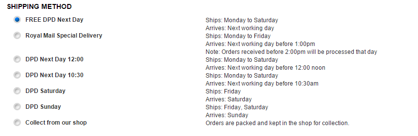
The Ecommerce comes first, our old site though simple and easy to navigate was too dated and losing us market share as it lacked so much on the technical background stuff.
Already Caseking from launching their new website (same software) has seen large growth in B2C sales.
The site was launch midnight Saturday as Sunday is our lowest volume traffic day so ideal for putting the new site live to see how it goes without harming business too much.
We can now resolve the issues, improve optimisation and edit the way it looks and navigates if need be. A mobile version will come soon and then no doubt the forums will get an update.")
Lovely ta Gibbo! Will order it now.
*Worked without using paypal as the payment option.
I don't get that, a site that makes it easier for customers to buy things is losing you market share compared to the new site which makes it more difficult to buy things.The Ecommerce comes first, our old site though simple and easy to navigate was too dated and losing us market share as it lacked so much on the technical background stuff.
The old site was simpler and easier to use. New one is very cluttered and looks a bit immature.

Any idea why I can only see orders starting MAY 2015 nothing before that? are they gone?
Ive got plenty of orders before that and its hard to keep track of them all
The site is rubbish I did not submit an order as I was trying to get the free delivery option to work before doing anything and guess what an order has been placed without me entering any bank details or my Santander security details
order ref 3000549 WEIRD or what